The Carter Blog
Carter ARTicles
Kinji Akagawa gets his own alphabet
Aug 17, 2022
Being an exhibition designer is a bit of an odd career. The challenge is to provide an environment that creates a visual backdrop for an interaction between the art and the visitor. In the best of circumstances, my choices as a designer give the visitor additional context while always ensuring the art itself remains the star of the show.
One of the Carter’s current temporary exhibitions, Art Making as Life Making: Kinji Akagawa at Tamarind, presented an opportunity to create an introductory graphic that highlights the hand of artist Kinji Akagawa (b. 1940) in his creations, and in his collaboration with other artists working at the Tamarind Lithography Workshop in Los Angeles. Taking a cue from Akagawa’s own prints and their fascinating combinations of images and words, the curator and I wanted to bring that sense of the artist’s hand into the introduction through the creation of a custom typeface based on Akagawa’s handwritten text.

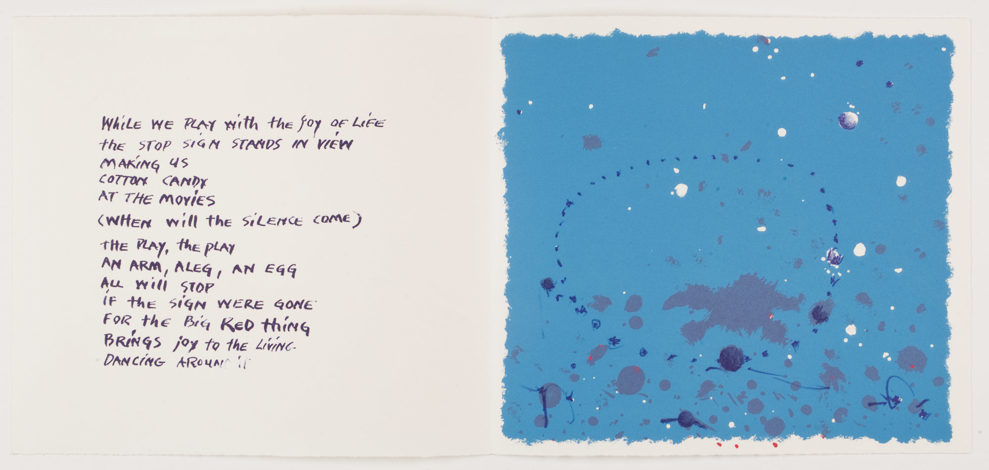
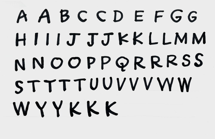
Alphabet assembled from Akagawa's handwriting, including multiple versions of several letters.
Although the basic pieces were there, it immediately became clear that a bit of work would be required to make this come together as a seamless whole. To emulate Akagawa’s handwriting, I needed multiple versions of each character to capture the irregularity inherent in the original handwritten text. Beginning with a search through the prints to find the required handwritten letterforms, I assembled a crude version of an alphabet that became the basis for the finished typeface. The differing weights resulting from the hand of Akagawa, and the printing process itself required adjustment to provide a more cohesive alphabet to work from.
Taking the original letterforms pulled from the prints, I redrew, traced, and modified each letterform to create vector images of the characters that would form the final title treatment. No two characters could look exactly alike. Letters were then adjusted to create multiple versions of each character that could be recombined to create the finished title. I then assembled the exhibition title letter by letter using Akagawa’s prints as a guide to letter spacing. It was then adjusted once more with letters slightly tilted or dropped out of exact alignment to better replicate the feel of Akagawa’s own hand. Finally, I placed the assembled title over a detail from Untitled (Black Rainbow II), one of the prints on view in the show, to create the entrance wall to the exhibition.
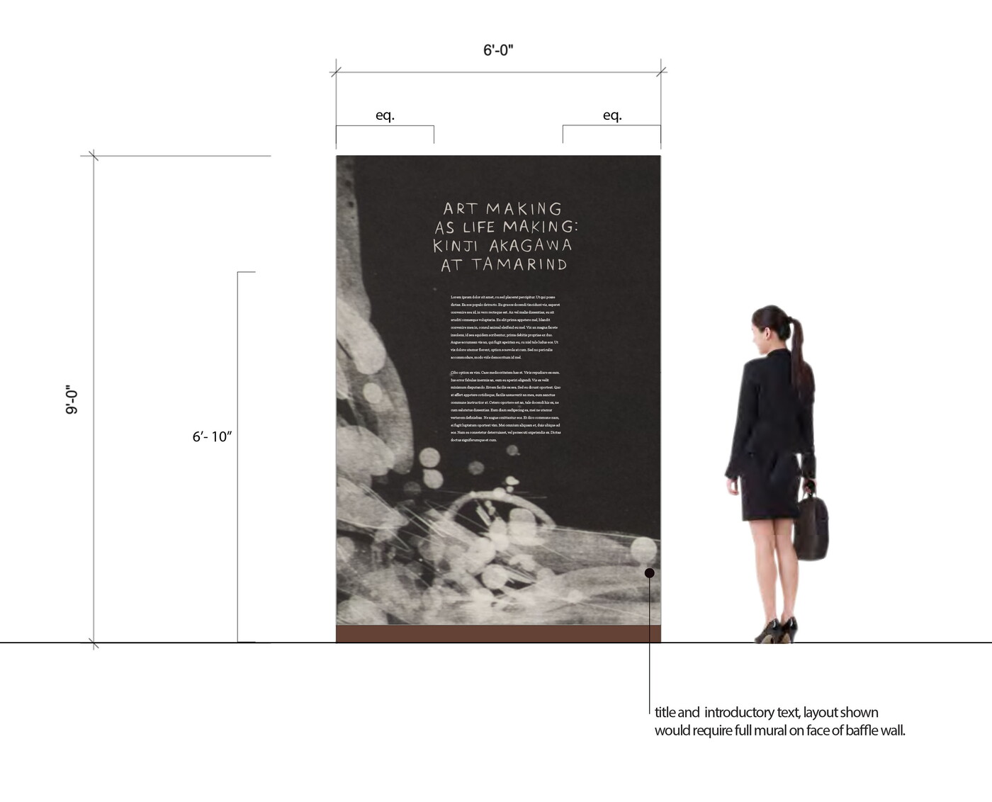
The final drawing showing how the entry feature would appear in the gallery.
The result is an entry graphic that reflects the work found within the gallery and reinforces the intense personal involvement of Akagawa’s hand in every work in the show. The enlarged detail from Black Rainbow II provided additional insight into printmaking techniques as well, encouraging visitors to look more closely while focusing on the maker and both his mastery of the medium and the collaboration that informed each work on display.
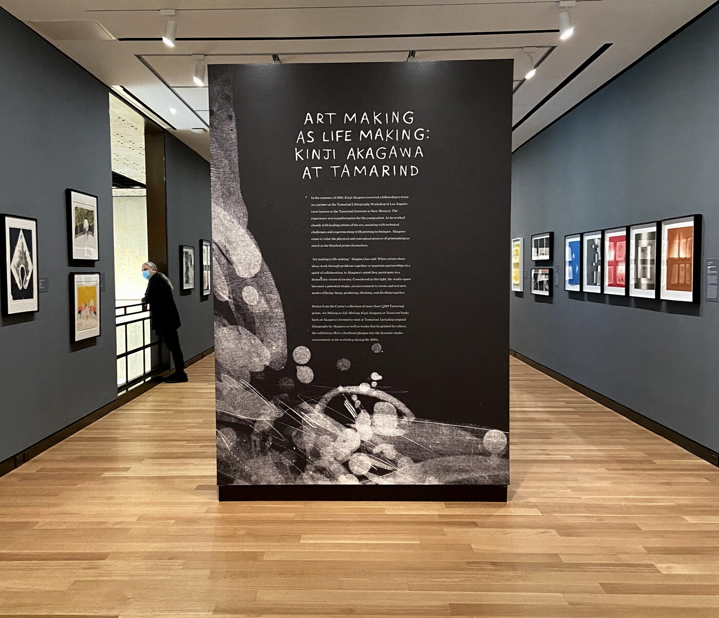
The finished entry of Art Making as Life Making at the Carter.
I hope you all have an opportunity to come out and see the results in person. Art Making as Life Making: Kinji Akagawa at Tamarind is on view through October 30, 2022.